Introduction
In the era of big data, data visualization is a vital tool for analyzing and presenting complex data sets, enabling effective reporting and analytics to extract valuable insights for informed decision-making. Data visualizations like graphs and charts allow us to quickly identify patterns and trends and communicate insights concisely. Dashboards offer a powerful way to present real-time, interactive data for faster and more accurate decision-making. In contrast, traditional analytical approaches are often tedious, time-consuming, and vulnerable to security risks like data breaches. By switching to dashboards, individuals can grasp key insights instantly, resulting in enhanced productivity and efficiency.
Inclusive Dashboard Design:
While dashboards are designed to facilitate faster data interpretation, benefiting the majority of users, inaccessible dashboards exclude a significant minority with color vision deficiency. The efficiency in data interpretation often comes at the cost of accessibility for them. Ironically, by creating dashboards that are not inclusive, we are making their lives even more challenging by hindering their access to accurate information, thereby creating knowledge gaps that lead to poor decision-making and affect the overall efficiency of the organization. As per the World Health Organization (WHO), color vision deficiencies affect about 8% of men and 0.5% of women globally. So, optimizing our dashboards for color blindness is very crucial. Inclusive dashboard design, compliant with accessibility guidelines like WCAG (Web Content Accessibility Guidelines), breaks down barriers to data accessibility, empowering everyone through effective data visualization.
Color Vision Deficiency:
Color Vision Deficiency impairs the ability to accurately perceive colors or distinguish between them. This condition typically results from inherited or functional variations in one or more three classes of cone cells in the retina, which mediate color vision. Accordingly, its severity ranges from mild to complete color perception loss.
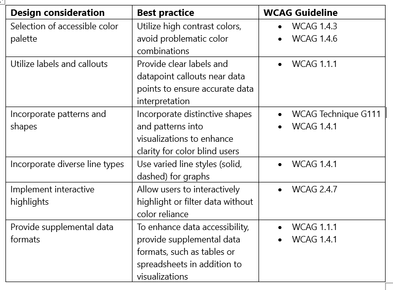
Table 1 – Design Considerations to Create Accessible Dashboards for Users with Color Vision Deficiency
Designing Inclusive Dashboards in Kibana for Color Vision Deficiency:
Kibana is an open-source tool designed for data visualization and exploration, commonly used for log analysis, time-series analytics, application monitoring, and operational intelligence.
1. Select a Colorblind-Friendly Palette
Ensure color accessibility in visualizations by utilizing color blind-friendly palettes in Kibana.
2. Use Labels and Callouts
Implement labels and callouts for effortless data interpretation.
3. Enable Interactive Highlighting
Kibana has built-in highlighting capabilities. When the user hovers over or selects a data point, it automatically highlights related data points. Enabling the legend option allows the user to hover over or click on the legend to highlight or filter data.
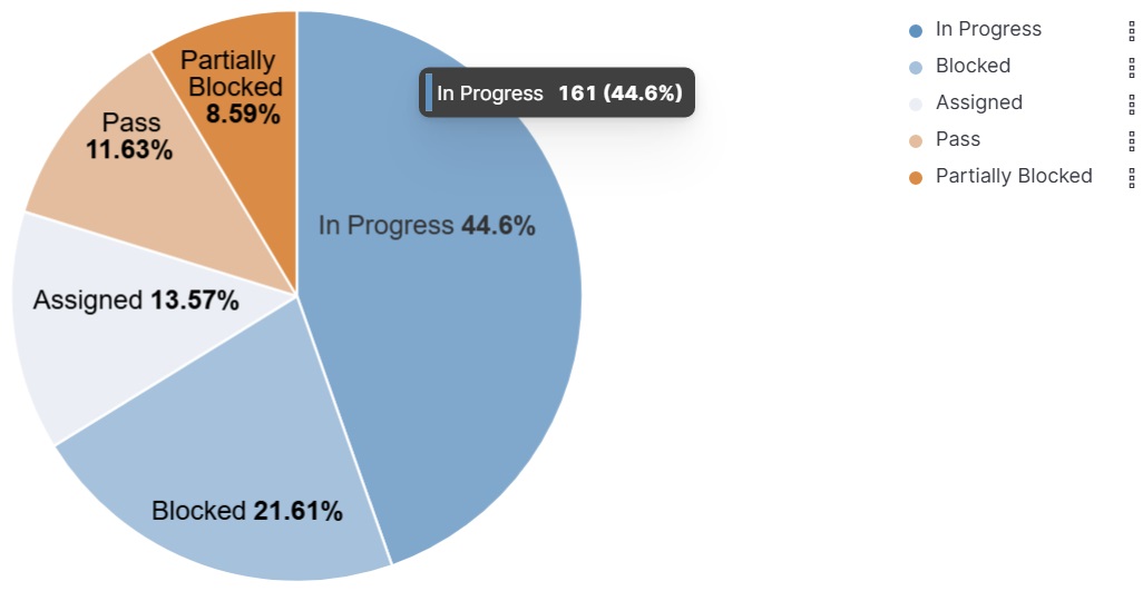
Figure 1 – Accessible Kibana Visualization for Color Vision Deficiency
Validate the Inclusivity of Dashboards:
Assessing the accessibility of our dashboards is crucial to ensuring that they are inclusive for everyone. Various useful tools are available to simulate color blindness, enabling us to assess our dashboards’ accessibility and ensure effective data interpretation for users with color blindness.
Coblis:
Coblis is a free proprietary online tool that helps assess the accessibility of visualizations by simulating color blindness. Ensuring that the users with color blindness can interpret every data element accurately.
Color Oracle:
Color Oracle is an open-source color blindness simulator. It applies a full-screen color filter to the dashboard you are designing so that we can ensure that the colors we use are sufficiently contrasting for a user with color blindness.
Conclusion:
Individuals with color vision deficiencies continue to confront challenges in interpreting data that rely on color-coded information. These challenges persist despite the availability of tools and strategies to enhance accessibility. Designing for accessibility is about creating dashboards that convey information clearly and accurately to everyone. Thus, it is critical to implement measures that ensure effortless and effective data interpretation. Utilizing the correct color palette, incorporating unique patterns, shapes, labels, callouts, and interactive highlights, and providing supplemental data formats greatly enhance the accessibility and inclusivity of our dashboards. Most significantly, it will provide optimal access to vital information for all users thereby eliminating any barriers and ensuring equal opportunities for all.
References:
• WCAG 2 Overview. https://www.w3.org
• Applications of Color in Design for Color-Deficient Users. https://journals.sagepub.com
• Data Visualizations, Charts, and Graphs. https://accessibility.huit.harvard.edu
• How to make charts and graphs more accessible. https://blog.pope.tech/2023/08/31/how-to-make-charts-and-graphs-more-accessible/